What I did
My Role: Senior Product Designer
Year: 2023
Skills Applied: UX Research, strategy, visual design, branding, and conversion optimization
Tools: Figma, Miro, and Notion.
Project overview
Lopes Avalia is an AI-powered pricing algorithm focused on the secondary real estate market in São Paulo, Brazil. Its primary purpose is to provide realistic property valuations based on historical and market data, helping:
• Attract qualified leads from property owners
• Support the property acquisition team with accurate pricing
• Streamline the listing process through automation
• Support the property acquisition team with accurate pricing
• Streamline the listing process through automation
Despite its strategic value, the product had seen no significant updates since 2021, and its UX presented friction points that limited its performance.
Why Mobile-First?
Why Mobile-First?
More than 70% of users accessed Avalia via mobile, either through organic search or agent referrals. Prioritizing mobile wasn’t a choice, it was a necessity.
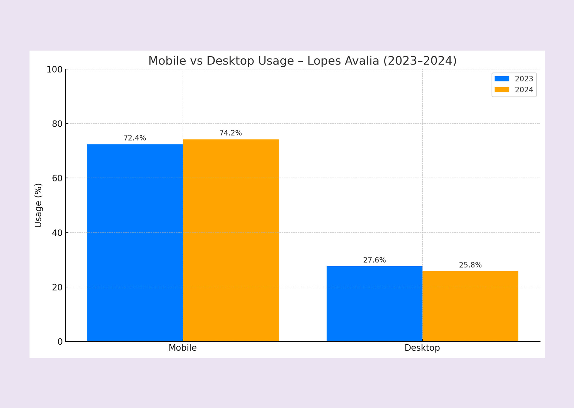
Bar chart illustrating mobile vs. desktop usage in 2023 and 2024, reinforcing the strategic decision to prioritize mobile-first design.
How AI powers Avalia
While traditional pricing tools rely on static formulas or basic regression models, Avalia goes further by integrating machine learning techniques to deliver more precise and adaptive valuations.
The algorithm processes a large volume of historical sales data, captures price fluctuations across neighborhoods, and identifies local market trends. What differentiates Avalia is its ability to learn from past behavior and adjust its predictions in real time, making each valuation smarter over time.
Behind the scenes, Avalia uses regression-based ML models to transform raw data into actionable pricing insights. As Lead Designer, I partnered with data science stakeholders to ensure these AI-driven predictions were accurate and communicated through intuitive UX, turning complexity into clarity for the end user.
Problem framing
We believe that:
Homeowners interested in selling their property need a fast, trustworthy, and self-service way to estimate its value, because it helps them make an informed decision to proceed with listing.
Our current experience is too technical, too long, and visually inconsistent, making users drop off before completing the process.
So:
We redesigned Avalia to prioritize clarity, simplicity, and trust, turning it into a powerful growth tool within Lopes’ acquisition funnel.
The original interface featured redundant inputs, harsh contrast, and unclear user guidance, leading to high drop-off rates.
Competitive benchmarking
• Conducted a UX audit of 5 direct and indirect competitors.
• Identified common patterns in information hierarchy, tone, and mobile layout.
• Used insights to inform prioritization of layout, structure, and positioning.
• Identified common patterns in information hierarchy, tone, and mobile layout.
• Used insights to inform prioritization of layout, structure, and positioning.

Competitive benchmarking to identify opportunities across accessibility, layout, and hierarchy.
Usability testing
• Ran moderated usability sessions with 6 participants.
• Gathered feedback across the full flow (screenshots mapped to comments).
• Identified repeated drop-offs and confusion points.
• Gathered feedback across the full flow (screenshots mapped to comments).
• Identified repeated drop-offs and confusion points.
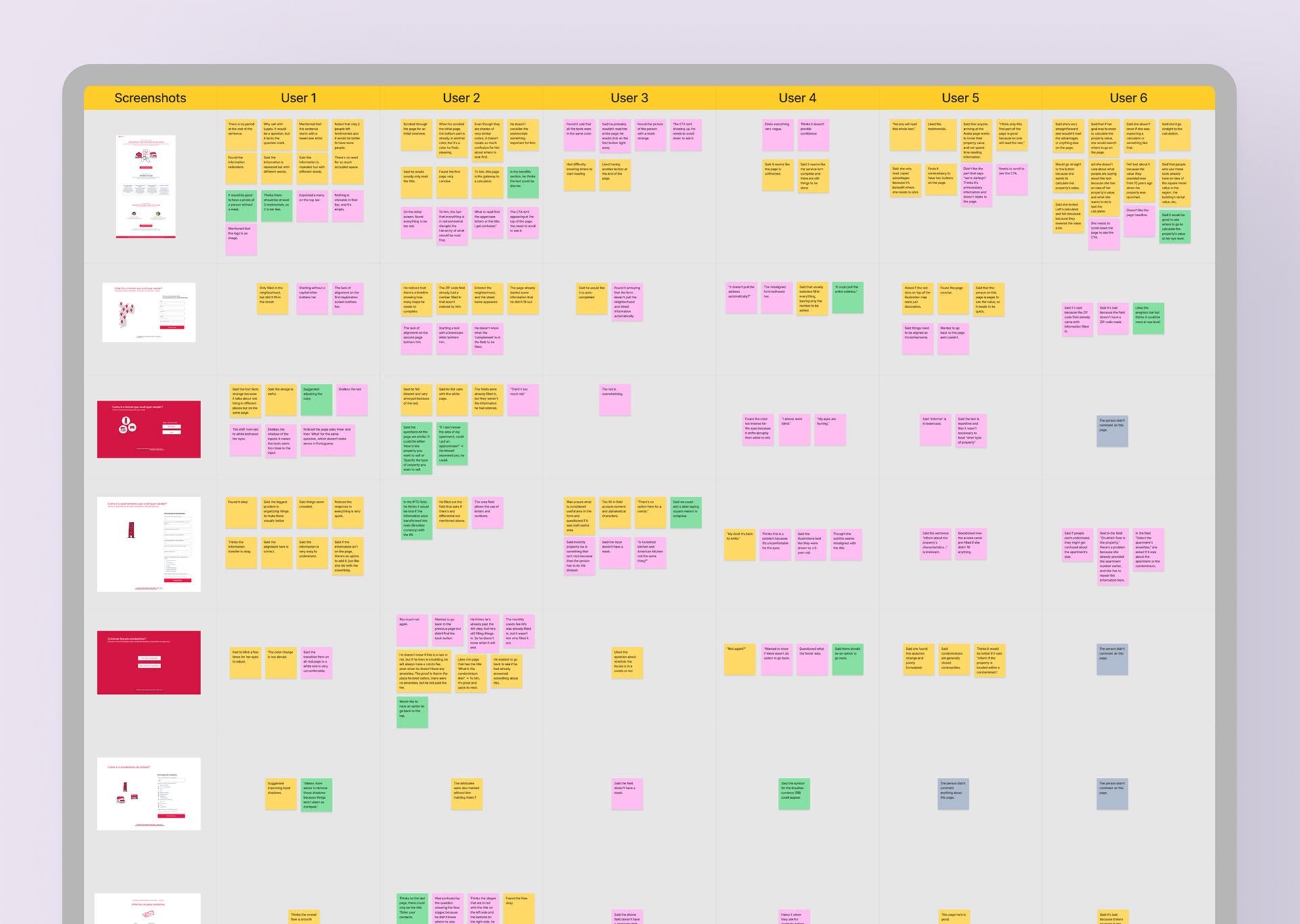
User feedback was mapped by screen during moderated usability testing sessions.
UX strategy and design principles
• Reorganized question flow into logical groupings to reduce friction.
• Refined microcopy to make each field self-explanatory.
• Applied new brand guidelines: colors, spacing, typography.
• Improved accessibility by adjusting contrast and spacing.
• Replaced legacy illustrations with modern, minimal visuals.
• Refined microcopy to make each field self-explanatory.
• Applied new brand guidelines: colors, spacing, typography.
• Improved accessibility by adjusting contrast and spacing.
• Replaced legacy illustrations with modern, minimal visuals.

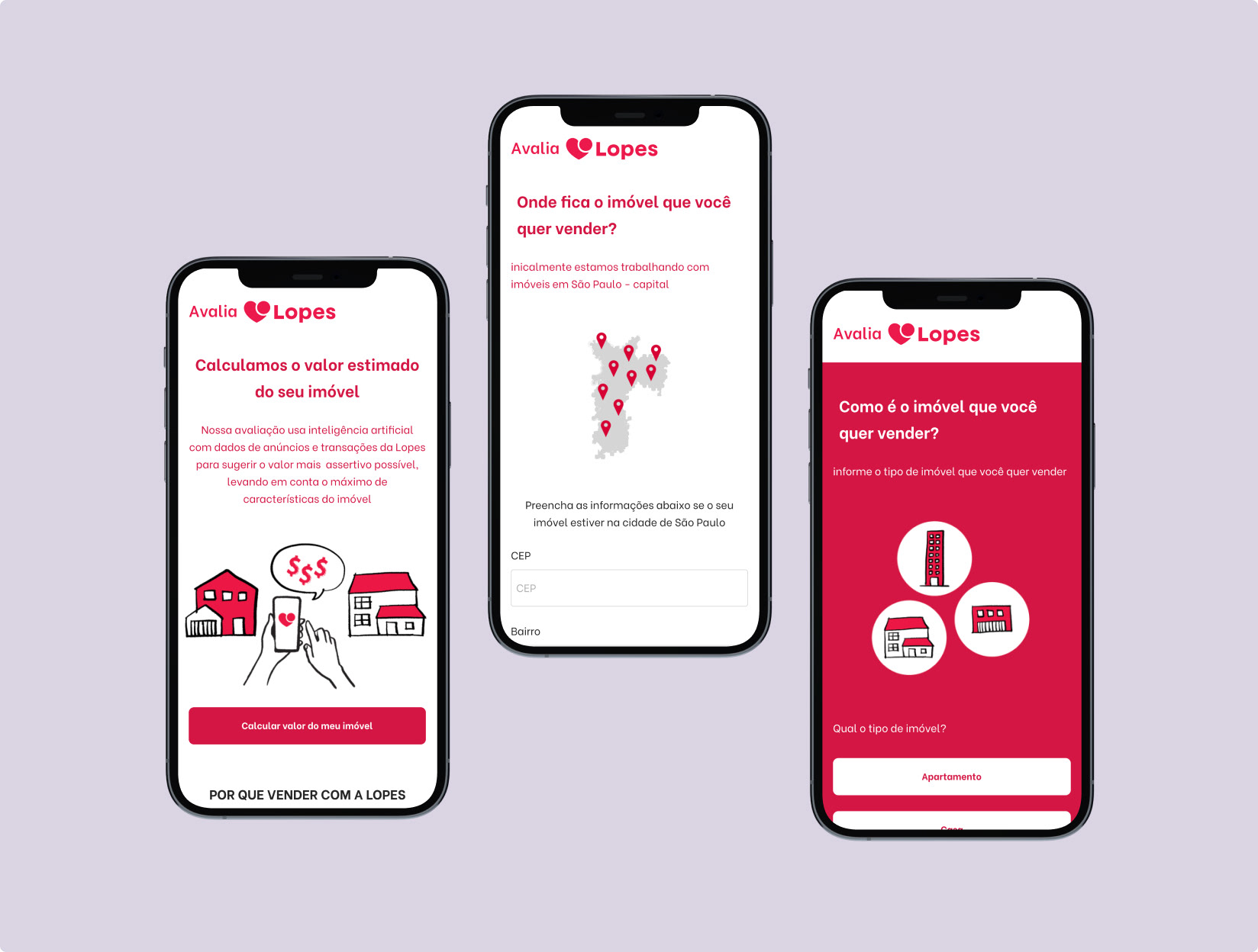
First low-fidelity wireframes reflecting reorganized flow and microcopy strategy.
Final UI design showcasing improved accessibility and brand alignment.
Strategic delivery and documentation
• Executed a responsive, mobile-first design aligned with brand and accessibility guidelines.
• Collaborated with marketing to ensure messaging consistency and rollout.
• Created structured documentation for future iterations.
• Collaborated with marketing to ensure messaging consistency and rollout.
• Created structured documentation for future iterations.
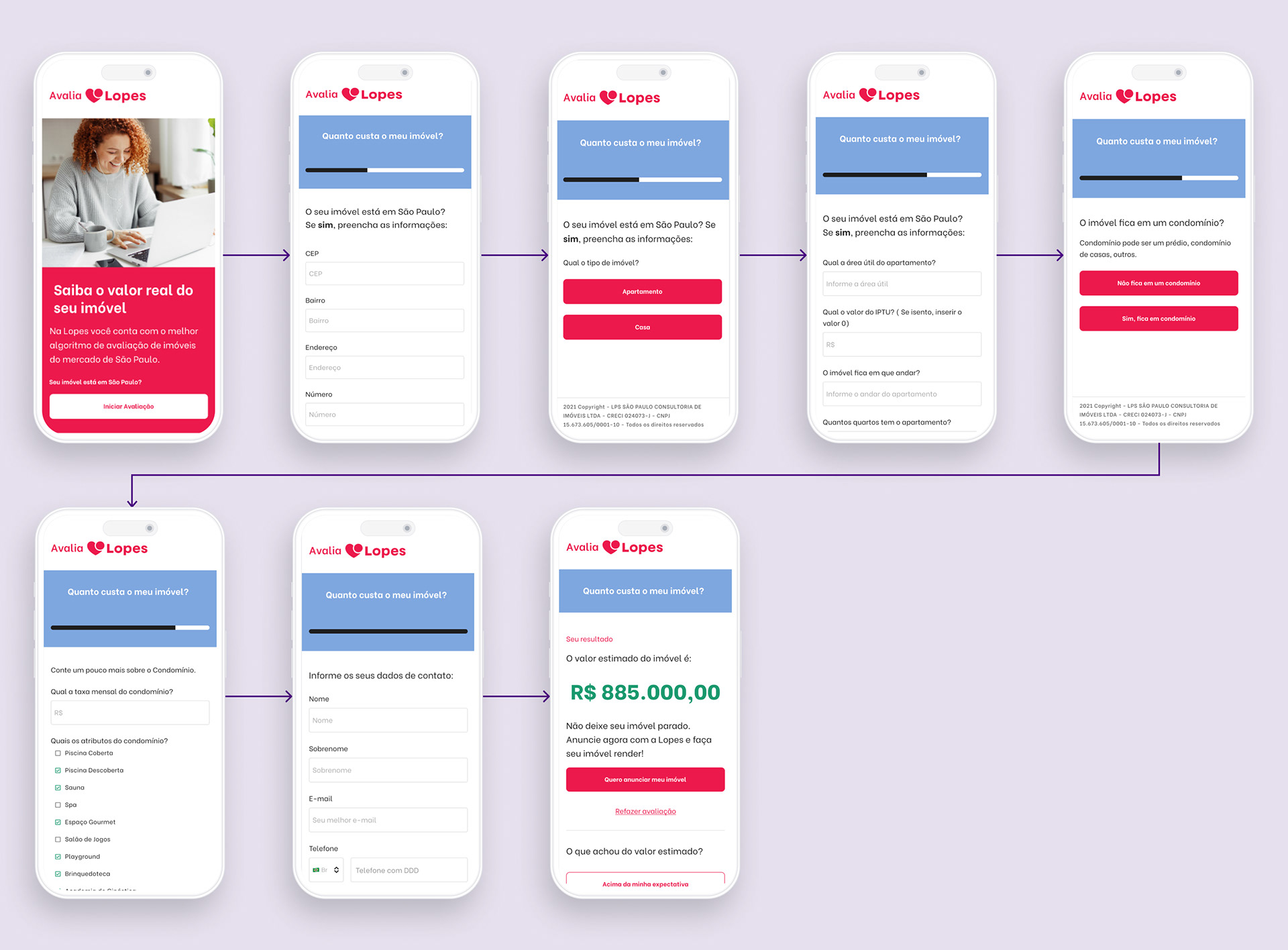
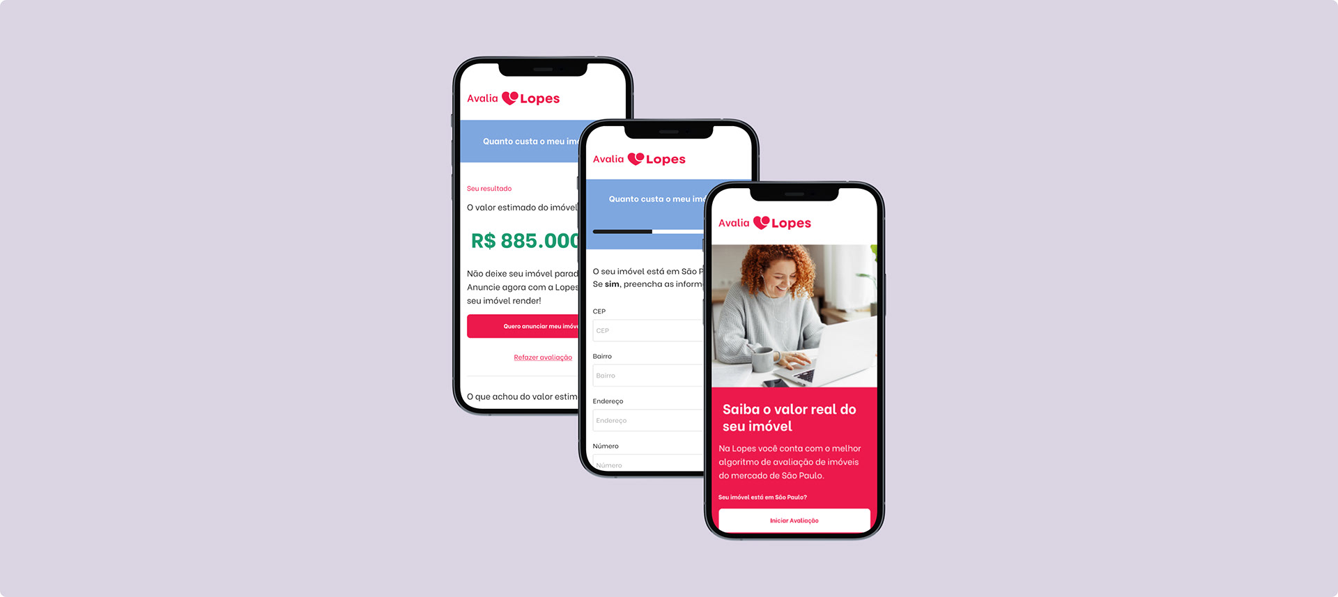
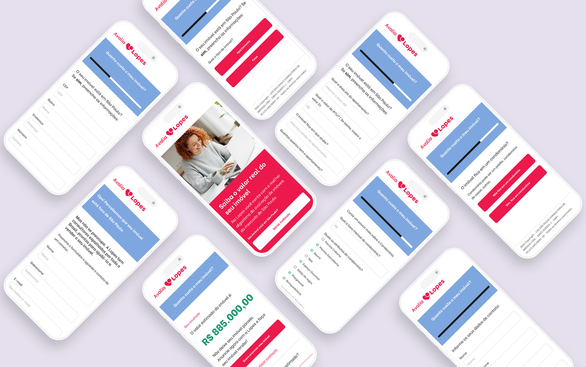
Final mobile flow showcasing all six stages of the evaluation journey.

Edge case screen for users with properties outside São Paulo.
Business results
After the redesign:
• Unique viewers: 22,309
• Unique conversions: 4,733 (18.18%)
• Conversion Rate: 18.18%
• Unique completions: 2,273
• Completion Rate: 9.09%
These results reflect the sustained impact of the UX improvements, even without investment in paid traffic.
Key Learnings
• Simplicity and clarity in copy often outperform visual redesign alone.
• Strategic documentation enables continuity, even without a dedicated team.
• Without ownership, great products risk stagnation.
• Design decisions grounded in user behavior, like going mobile-first, proved essential for unlocking conversion and completion gains.
• This project demonstrates how reframing the UX from a business and user perspective, backed by testing and structured delivery, can unlock new value even within operational limitations.
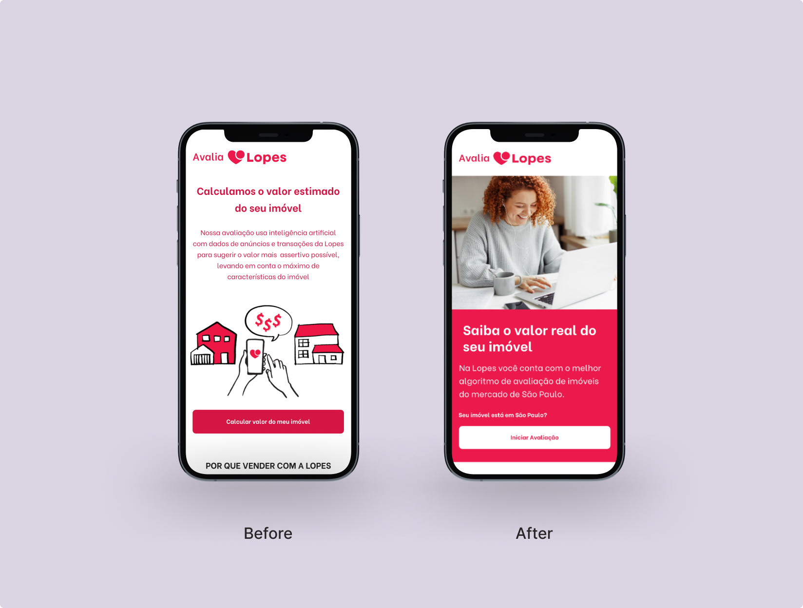
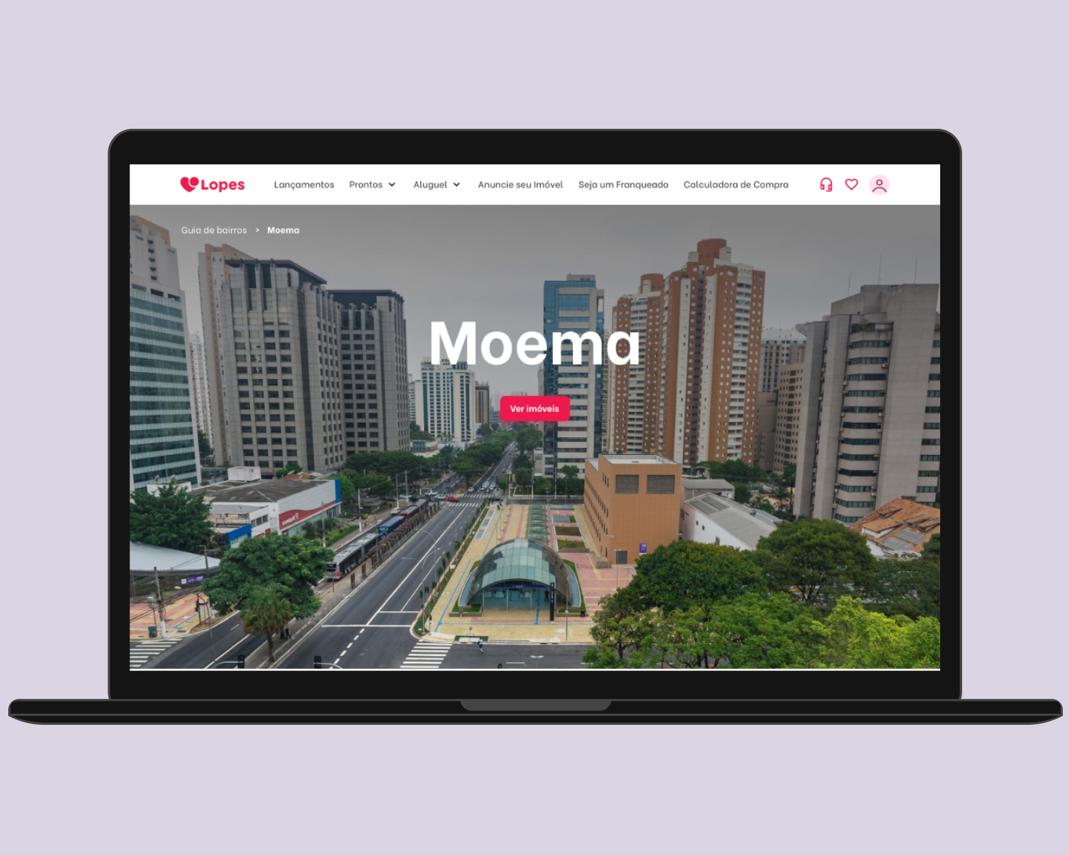
Visual evolution of Avalia’s homepage. The redesign improved visual hierarchy, clarity, and brand consistency, directly impacting user trust and completion rates.